🍔 Biteflation #1: Where the project started
27 Jul 2024
As a frequent consumer of food delivery, I noticed that my budget took a hit with every price hike, which seemed to happen more often as we transitioned from the pandemic to the new normal.
This led me to the question: how much do fast food prices increase over a period of time? Are price hikes proportionate with headline inflation (or with overall food inflation), or do they tend to be much higher, compensating for the fact that restaurant prices are typically more “sticky” than groceries?
It turns out that there is no easy answer due to limited data availability, which obscures the true impact of the price hikes on consumers. On an aggregate level, the Philippine Statistics Authority reports on the price index for “food and beverage serving services,” yet no distinction is made between full-service and limited-service. Additionally, aggregated data may mask significant variations in pricing strategies among different restaurant types.
Restaurant-level data, at least for the most popular chains, would prove useful in gaining a more nuanced perspective. There are two issues, however:
- Historical restaurant menu data is generally unavailable, at least in a consistent format suitable for data analysis. Makes total sense — most restaurants don’t want to draw attention to the fact that they’re increasing prices. There isn’t a standardized menu layout or repository in the industry.
- If prices for each menu item were available, the problem now may be too much granularity. It would be challenging to create a composite price index per restaurant or for the entire Philippine fast food industry in general because relative quantity demand for each individual item would not be as apparent than published prices.
Leveraging fast food aggregator data
The Biteflation project was born when I saw an opportunity to address the first problem using fast food aggregator data.
For restaurants to be listed in an aggregator’s delivery service, menus need to be stored in a consistent data format. Unlike menus on the company’s website or social media pages which are sometimes outdated, we can reasonably expect the service to reflect the latest prices. This would basically allow one to keep track of menu item prices daily and note any changes.
However, getting data from a food delivery app would still be a painstakingly manual process, especially with the hundreds of products and variations across restaurants — solo, small meal, medium meal, large meal, etc. Interestingly, one food aggregator’s hidden web API provided a structured JSON response containing all the menu data.
Long story short, a structured version of the restaurant data can be obtained using existing Web technologies. Yes, the structure was very complicated as it was deeply nested and had a convoluted way of storing some data (particularly product variations and add-ons!), but all the menu data was there. Data transformation and processing could come later.
All that was needed is a mechanism to download the data and store it automatically on a daily basis. A simple Python script and GitHub Actions allowed for just that.
Soon enough, I had more than 500 days of *.json files for each restaurant. This ended up taking >1GB of storage just for plain text restaurant data. Certainly, the data download process could have been more efficient, with new *.json files stored only when there were actual changes in the menu contents. Nevertheless, keeping the raw data intact also provides the most flexibility for data manipulation later on.
And two years ago, I didn’t really know how to process all the data… 😅
All I knew was this could potentially lead to more interesting insights into pricing strategy, such as:
- when restaurants tend to implement price changes — is there a particular day (1st of the month) or cadence (every x months)?
- what menu items often change in price and to what extent — do restaurants focus on core/add-on items for their price increases? do they change the prices of all their items simultaneously or take a staggered approach? are price changes in response to supply chain shocks related to direct raw materials?
- how restaurants react to changes in competitor prices — do restaurants increase their prices in response to their competition? if so, in what timeframe and in what proportion?
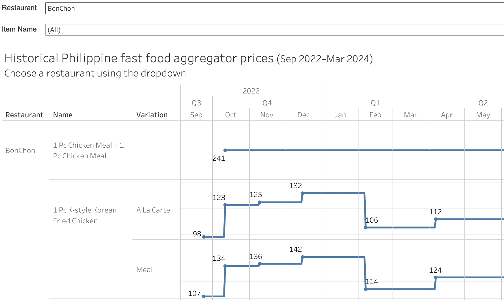
This is the first part in a series of articles sharing my data science learning journey through the Biteflation project. Next time, I’ll delve into how I processed the data and generated the dashboard below.

You can view the Tableau Public visualization here. You can also browse the GitHub repo.
