🍔 Biteflation #2: The art of menu data wrangling
24 Oct 2024
After collecting hundreds of restaurant menu files, I found myself stuck. Each JSON file contained a deeply nested data structure that would make my device hang when I tried to open it. The sheer volume of data – over 1GB of plain text files – made manual analysis impractical.
The breakthrough came when I discovered Microsoft Fabric, an all-in-one analytics platform that leverages familiar tools like Python, SQL, and Power Query. Coincidentally, Microsoft was running a Cloud Skills Challenge that offered a certification for completing a Fabric learning path and passing an exam. This presented the perfect opportunity to learn a new platform while reviving a shelved project.
To avoid getting overwhelmed, I started with a clear minimum viable product: create a dataset tracking price updates for each product variation across all restaurants in my sample. The essential data points would include:
- Restaurant name
- Product name
- Product variation (if any)
- Date of price record
- Price amount
Since I had daily data for these restaurants, I decided to focus on capturing just the first day when each price changed – a key simplification that would make the analysis more manageable.
Technical deep dive: Taming complex JSON data
The JSON structure presented several challenges. Each menu was deeply nested, in a format similar to this:
{
  "data": {
    "menus": {
      "menu_categories": [
        {
          "name": "Snacks",
          "items": {
            "products": [
              {
                "name": "Fries",
                "product_variations": [
                  {
                    "name": "Large",
                    "base_price": "...",
                    "topping_ids": ["..."]
                  }
                ]
              }
            ]
          }
        }
      ],
      "topping_classes": [
        {
          "name": "Fries Add-ons",
          "options": [
            {
              "name": "Cheese",
              "addon_price": "..."
            }
          ]
        }
      ]
    }
  }
}
For simplification, I focused on base prices at the product variation level, setting aside the complexity of topping options. This decision came with trade-offs – we might miss price changes hidden in menu restructuring, such as when restaurants move items between variation types or convert standalone items into topping options.
My approach followed an adapted medallion architecture, processing the data through three increasingly refined stages:
The medallion architecture, popularized by Databricks and adopted by Microsoft Fabric, is a data processing pattern that progressively refines raw data through three layers: bronze (raw), silver (cleaned), and gold (business-ready). This approach, inspired by traditional data warehousing principles, helps manage complexity while ensuring data quality and maintainability.
Bronze stage: Initial data extraction
I began by working with a small subset of restaurant-date combinations to validate my approach before scaling up. Using PySpark, I created a “bronze” dataset that simply flattened the nested JSON structure while preserving all original fields.
# Define menus_df as the first item in df.data.menus
menus_df = df.select("filename", "data.url_key", "data.code", explode_outer("data.menus").alias("menus"))
# Flatten the first layer of menus_df without using the function
menus_df = menus_df.select("filename", "url_key", col("code").alias("restaurant_code"), "menus.*")
display(menus_df)

categories_df = menus_df.select("filename", "url_key", "restaurant_code", explode_outer("menu_categories").alias("menu_categories"))
categories_df = flatten_dataframe(categories_df)
display(categories_df)

# For each item in the menu_categories_products column/array in categories_df, create a new row in products_df. Each row in products_df should contain the column menu_categories_code from categories_df, as well as all columns from the menu_categories_products column/array in categories_df.
products_df = categories_df.select("filename", "menu_categories_id", "menu_categories_products")
products_df = products_df.select("filename", explode_outer("menu_categories_products").alias("menu_categories_products"), "menu_categories_id")
products_df = flatten_dataframe(products_df)
products_df = renameColumnPrefix(products_df, "menu_categories_products_")
display(products_df)

variations_df = products_df.select(explode_outer("product_variations").alias("variation_data"), "*").drop("product_variations")
variations_df = flatten_dataframe(variations_df)
display(variations_df)

variations_df.write.format("parquet").mode("overwrite").saveAsTable("variations")
Silver stage: Data refinement
The silver stage involved SQL transformations to:
- Remove unnecessary columns
- Filter out null/missing values
- Standardize data formats
CREATE OR REPLACE TABLE SILVER_MENU_DATA.variations
USING DELTA
LOCATION 'Tables/variations'
AS
WITH extracted_data AS (
  SELECT
    *,
    -- Extract the last part of the filename (after the last '/')
    regexp_extract(filename, '/([^/]+)$', 1) AS short_filename
  FROM
    BRONZE_MENU_DATA.variations
)
SELECT
    short_filename,
    menu_categories_id,
    id,
    code,
    name,
    file_path,
    logo_path,
    variation_data_code,
    variation_data_id,
    variation_data_name,
    variation_data_price
FROM
    extracted_data
WHERE
    menu_categories_id IS NOT NULL
    AND id IS NOT NULL
Gold stage: Analysis-ready dataset
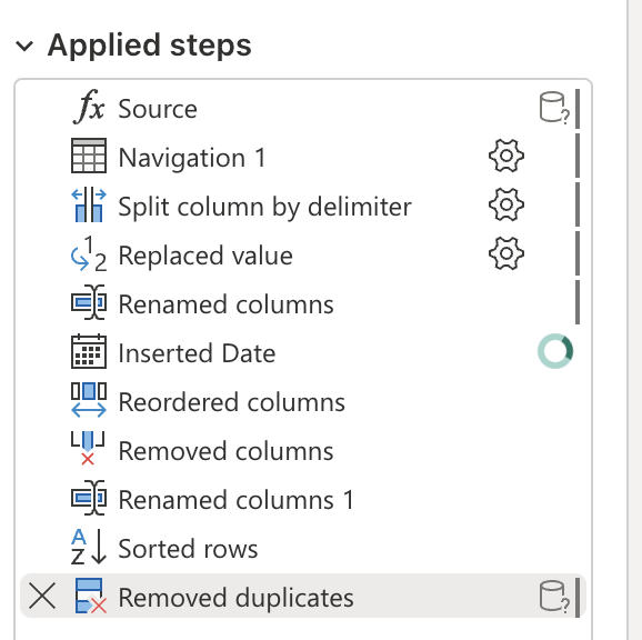
The final gold dataset was prepared using Power Query, where I:
- Removed duplicate prices (keeping only the first date of each price change)
- Retained only the MVP columns defined above apart from some identifiers
- Created the final structure used for visualization
Data cleaning challenges
The most significant challenge was handling inconsistent item names across time. For example, a restaurant might list the same item as:
- “Spaghetti (Solo)”
- “Spaghetti Solo”
- “Spaghetti (Ala Carte)”
To address this, I used the combination of item ID and restaurant name as the unique identifier, rather than relying on item names. While this approach handles direct name changes, it doesn’t capture more complex scenarios such as:
- Deleted items reappearing with new IDs
- Changes in item hierarchy (e.g., splitting a single item into variations)
- Menu restructuring
A future enhancement could leverage AI to identify and reconcile these more complex naming and structural changes, enabling more accurate price trend analysis.
Leveraging Microsoft Fabric
Several features of Microsoft Fabric proved particularly valuable:
-
Cloud processing. The ability to run data transformations in the cloud meant I could process large datasets in the background without overwhelming my local machine.
-
VS Code integration. Seamless integration with Visual Studio Code maintained my preferred development environment while accessing Fabric’s capabilities.
-
Power Query. The low-code approach to data transformations made common operations accessible, especially useful for those newer to SQL or Python.
-
End-to-end analytics. While I ultimately used Tableau for visualization (due to trial limitations), Fabric’s direct integration with Power BI showcases its potential as a complete analytics solution.
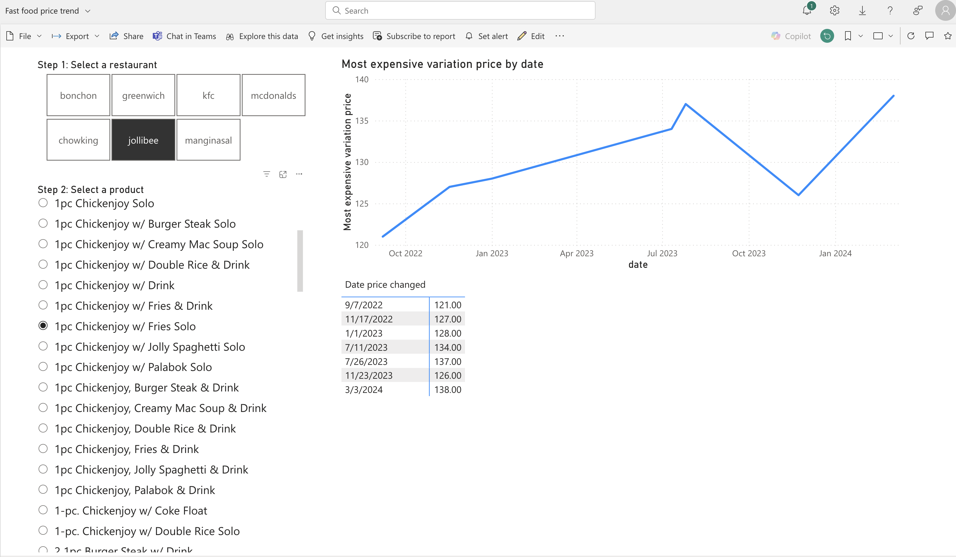
Though I didn’t get to explore it during my trial, Microsoft’s Copilot integration could potentially streamline future analysis workflows.
Early insights
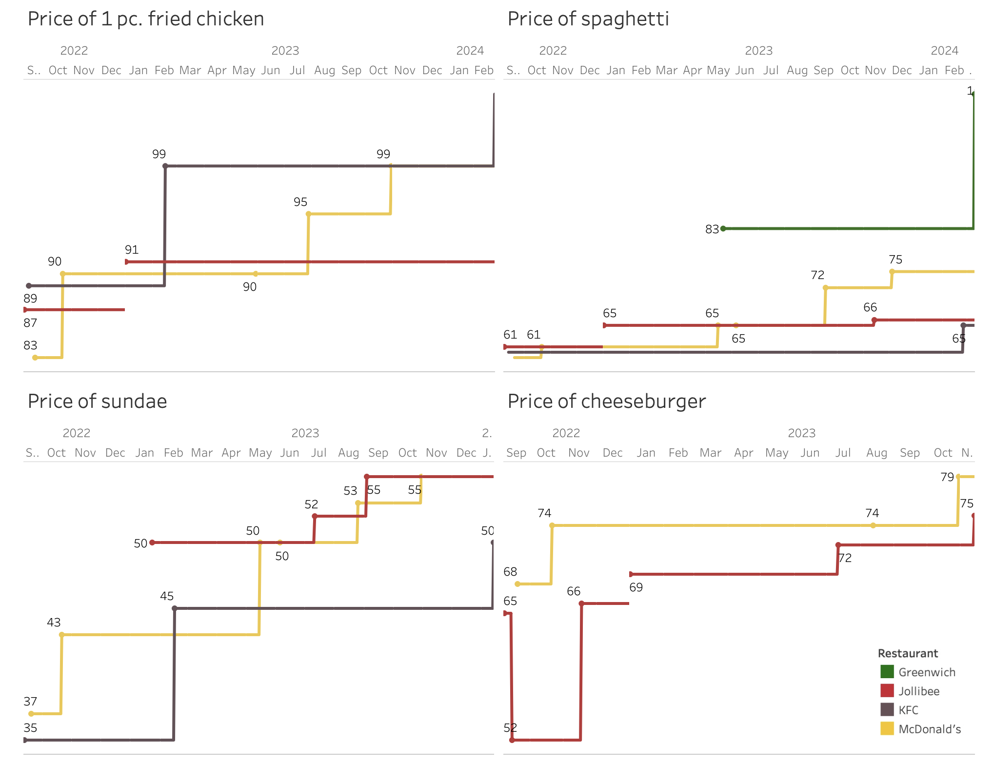
Initial analysis reveals several interesting patterns:
-
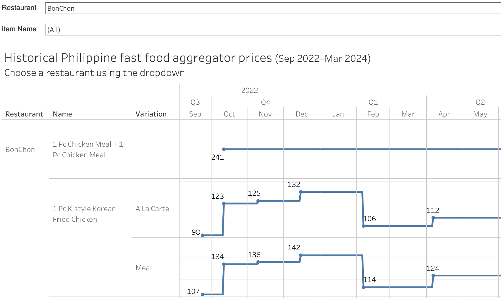
Inflationary pressure. The general trend shows steady price increases across items and restaurants, reflecting broader economic pressures.
-
Strategic pricing. Core items like fried chicken show remarkable price stability, occasionally even decreasing. This suggests their use as loss leaders to drive customer traffic.
-
Competitive dynamics. Similar price movements across restaurants, particularly evident in sundae pricing, hint at active competitive monitoring and matching.
Next steps
With our foundation of clean, structured data in place, we’re ready to dive deeper into the key questions:
- What drives the timing of price changes?
- Which menu items see the most frequent updates?
- Do restaurants respond to competitors’ price changes?
Stay tuned for Part 3, where we’ll explore these questions and more through detailed analysis.
You can view the Tableau Public visualization here. You can also browse the GitHub repo.

